Favorite Paint Colors {My Picks + A Series Recap}
Sharing a recap of the top paint picks from the Bloggers’ Favorite Paint Colors Series, plus three colors I’m currently drawn to.
Back in August, I invited a few of my favorite design bloggers to share some of their favorite paint colors. Perhaps you’ll remember the eye-catching color of Ashley’s playhouse or John and Sherry’s beautiful bedroom? Those turned out to be some of my most popular posts ever, telling me that paint is a hot topic.
It really didn’t surprise me, since paint consultations are amongst the most requested services within my business, and I’m often asked about the latest trends in paint colors. Just yesterday, I was picking up items from the dry cleaners and somehow the conversation led to paint!

When I wrote those posts, I told you I had a list of my own paint front-runners that I’d share with you. Some of them are paint colors I’ve used within our home. Others are suggestions I made for clients (that I couldn’t be happier with).
It’s always important to keep in mind that, although these are tried and true colors, they don’t work in every situation. Lighting, both natural and artificial, flooring, and other room elements can greatly affect how a color appears on a wall. It’s important to go through a paint selection process to come up with the best color for your space.
My Favorite Paint Color Picks
Cashmere by Para
My current top paint selections for an all-over, use almost anywhere neutral is Cashmere, a beautiful soft greige from the Sarah Richardson Collection for Para (SR-13). We painted most of our basement this color. I love how light and airy it makes the space feel, while providing an element of coziness with it’s warmer undertone. I plan on carrying this color (or something similar) up onto the main floor.

Black Chalkboard Painted Walls
Although we’ve been seeing black chalkboard paint around for a while now, it’s still one of my favorite wall paint treatments to add personality, fun, and a bit of drama to a room. I think it looks smashing in Kevin and Layla’s kitchen.

Benjamin Moore Schooner
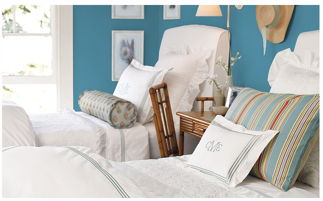
To pick just one more paint color, I’d have to go with Benjamin Moore Schooner (AF-520). This color reminds me of summer or a tropical vacation, which makes me happy on a dreary and cold winter day. Paired with white, this blue-green color is crisp and fresh, but can be warmed up with a touch of red or orange accessories like this bedroom from Pottery Barn.
Favorite Paint Colors Recap from This Series:

Ashley from The Handmade Home
Whispering Spring by Benjamin Moore
Chantilly Lace by Benjamin Moore
Calypso Blue by Benjamin Moore
Shannon from aka Design
Analytical Grey by Sherwin Williams
Scotch Mist by PPG
Wexford Fog by CIL
Sherry from Young House Love
Rockport Gray by Benjamin Moore
Dragonfly by Benjamin Moore
Sesame by Benjamin Moore
Emily from Emily A. Clark
Stunning by Benjamin Moore
Urbane Bronze by Sherwin Williams
Worldly Gray by Sherwin Williams
Tiffany from Living Savvy
Worldly Gray by Sherwin Williams
Smoke by Benjamin Moore
Albescent by Benjamin Moore
My Paint Picks
Cashmere by Sarah Richardson Collection for Para
Black Chalkboard Paint
Schooner by Benjamin Moore
Did you miss any of these paint color suggestions? Go here:
What are some of your favorite paint colors at the moment? Do you have any paint projects currently you’re working on? I’d love to hear about them!
Want more paint colour suggestions like these sent directly to your inbox? Be sure to SUBSCRIBE.
Happy painting!

I love BM’s Gray Wisp CC-670, Wickham Gray HC-171, and Chantilly Lace OC-65… but I’m also a sucker for good old Cloud White CC-40/OC-130 (Gasp, I know, right!). Our house also has pieces in BM Tropicana Cabana 2048-50 thanks to my daughter, and we still haven’t tired of its fun and cheery disposition! One I haven’t tried yet, but am dying to is BM Thunder AF-685… as recommended by Carol from The Design Pages! I have a line-up of painting projects, but with Fall here, I have to move my vehicle back into the garage, so I lose my work space. But I’m also in the middle of a course right now, so it’s probably better not to have the distraction tugging at me… so much more fun than studying!
You should try BM Thunder. Love that color as well. For whites, I really like Chantilly Lace too and Sarah Richardson’s Snowfall is gorgeous too. It adds a touch of warmth, while still looking crisp in a room.
For all the painting we have done in our house I’ve used Pittsburgh Paint and Behr. Most of the colors were browns and warmer tones when we did most of the painting in our house about 5 years ago. Now I’m drawn to bright, airy colors. Love the cashmere gray you chose! I recently discovered Benjamin Moore colors and love Moonshine (discovered on Young House Love). I can’t wait to use that color somewhere in my house to transform a room! Thanks for the post, I was wondering what your picks would be :)
It’s funny for you to say that most of your colors were browns and warmer tones 5 years ago. I think that was pretty typical and it seems like a lot of people are changing to neutrals with a touch of grey and lighter, fresher colors. We’ve lived in our current house for over 8 years now and I’m on the second round of painting. Definitely going to change it up a bit.
Choosing a paint color is stressful! I chose mine from reading favorite paint color posts on other blogs months ago so these posts really help. I love the Sherwin Williams colors I used downstairs, Mindful Gray and Comfort Gray. I think Mindful Gray looks good in so many different lights and can work in mosts people’s houses. Comfort Gray is a little trickier because it can look blue-gray or green-gray. Thankfully, I like both tones. I am determined to use BM’s Nantucket Gray one of these days, probably in the kids’ bathroom.
I haven’t used Sherwin Williams paint before, but it seems to a popular choice. BM’s Nantucket gray is a beautiful color, especially paired with yellow or indigo.
I just found you blog :) Thanks so much. I was planning on using Cashmere and Thunderstorm in our basement. Once I saw your basement was done those colours I am sure now! I am not sure which walls yet will be the Thunderstorm yet though. Our tv wall is over our fireplace and will have built ins on each side (you wont see any colour).