Get access to the MEMBERS ONLY LIBRARY!
SUBSCRIBE! Get access to the Members Only Library>
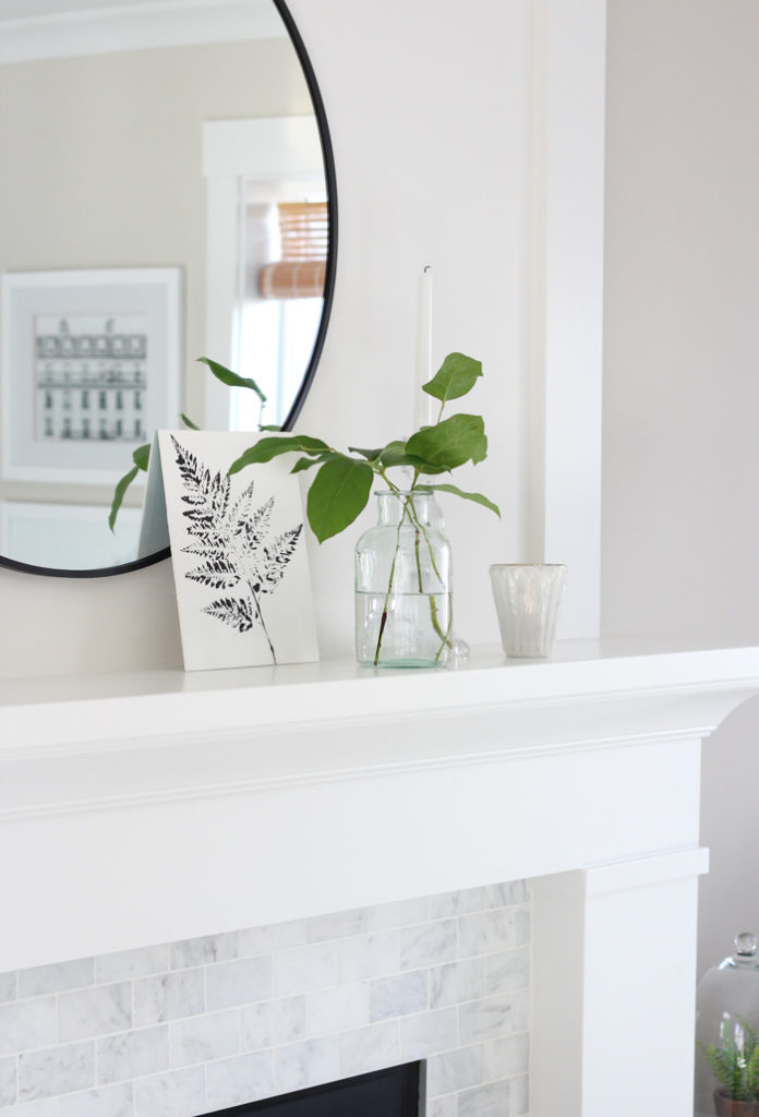
Looking for fresh new paint colours, but don’t know where to start? Get inspired by these favourite paint colours used in our home, plus top picks from some of my friends.