One Room, Two Looks
Check out these bonus room mood boards I put together using two different accent colours, red and turquoise. One room, two looks!
Following the completion of a sunroom E-Design for one of my clients, I was asked to create a plan for the bonus room as well. Similar to many scenarios I see time and time again, Patty had purchased new furniture pieces and a few decorative accessories, but she didn’t feel like the room was coming together. In her words, it was “kind of blah.”
Bonus Room Design Requirements
The main purpose of the bonus room was a place for Patty’s teenage daughter and her friends to hang out in. It also served as an occasional sleeping spot for her family when they visited. She wanted this space to have a more contemporary and fun vibe than the rest of the home, but still be classy and comfortable enough for everyone to enjoy.
After receiving photos, samples (paint swatches, carpet, furniture fabric, etc.), as well as written information about the room, I realized that Patty needed elements that would tie the room’s finishes, her furniture selections and accent pieces together. Although the furnishings were fantastic stand alone pieces, the overall look of the room was disjointed. In addition, some of Patty’s original purchases included red accessories, but she was open to any colour suggestions.
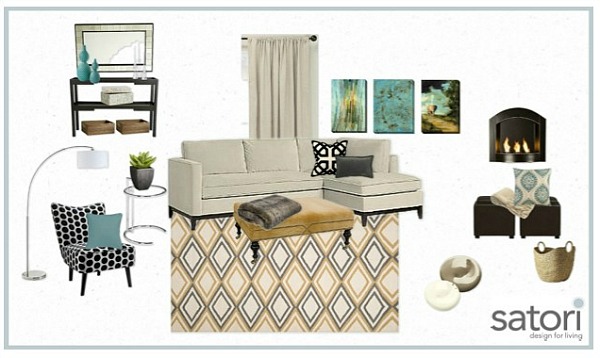
What I decided to do was create one general plan along with two different colour scenarios. The first scheme I put together incorporated the red décor items Patty had previously purchased and the second option included turquoise.
Mood Board with Red Decor

Mood Board with Turquoise Decor
Bonus Room Design Details
As you can see, I kept the main pieces in the room the same and merely swapped out the accessories. Within the plan, I included additional room suggestions, such as panel moulding, furniture placement, drapery details and more that aren’t shown here.
Patty loved the ideas and I’ll be finding out which colour scheme she has decided to go with when we do a follow up call this week.
Now it’s your turn! Which colour scenario for a bonus room would you select? Do you love the vibrant red or the cool turquoise? I’d love to know!
More Design Projects for Clients
Want more home decorating ideas like these sent directly to your inbox? Be sure to SUBSCRIBE.
Enjoy your day,

Note: Client’s details (such as budget breakdown, profile, etc.) have been excluded for confidentiality reasons. This plan is a snapshot of one of our E-Design Kits and does not showcase all components in order to respect the fees associated with our services. All designs and images are property of Satori Design for Living.
I am liking the blue and yellow the best! Fresh and relaxing!
The turquoise is my favorite, love your choices! The graphic rug and polka dot chair keep it fun, yet sophisticated!
Hi Shauna – I like the turquoise better. It looks fresh and modern. Nice thing about either scheme – a few simple accessory changes and you have a whole new look.
The turquoise is definitely my pick as well. I think that color scheme is more current for a teenage girl, yet sophisticated enough for adults too. Thanks for popping by!
I love the second color scheme the best. My favorites colors. It feels more inviting than the first one.
I’m loving the turquoise!
Love the turquoise! So beautiful and modern…perfect for a modern teenager!
I agree the second one is my favorite. Where did you find that rug? Love it!
Hi Mandy,
The rug is made by Frontier. Thanks for stopping by!
Shauna
I’m normally a red girl but I’d have to say the turquoise caught my eye here.
My vote is for the turquoise design. The colors are so warm and inviting.
The second one … love the touches of aqua and camel:)
I definitely prefer the second. I’m a sucker for that blue!
I like the first one because the pop of red creates a bold, signature statement.